Car manufacturing is almost a science and technology affair, but some aspects of the business also involve art.
This is especially true for logo design, which must convey a message and be significantly different from what is used by others.
The following examples can be found on cars sold today, but each was originally designed in the 20th century, even though some have been updated at least once since then.
Every car manufacturer has a distinctive logo or emblem that represents their values and shows their aspirations. Most car brands use solo or incorporated logos that combine expressive symbols with concise visual design for optimum impact and consistency, while others opt for a simple logo.
Car logo design plays an important role in identifying the company’s brand. Actually, it reveals the emotions that the brand wants its customers to feel through the interaction and purchase process. Moreover, people have many options when it comes to choosing a car. This is where the brand status of the car affects the buyers with branding.
Aside from its brand awareness and endurance, each logo has an exclusive story to share about its origins and development. Let’s take a look at the 10 most iconic car logos and the fascinating stories behind them.
1- MERCEDES- BENZ

Mercedes-Benz is a German and commercial vehicle automotive brand established in 1926.
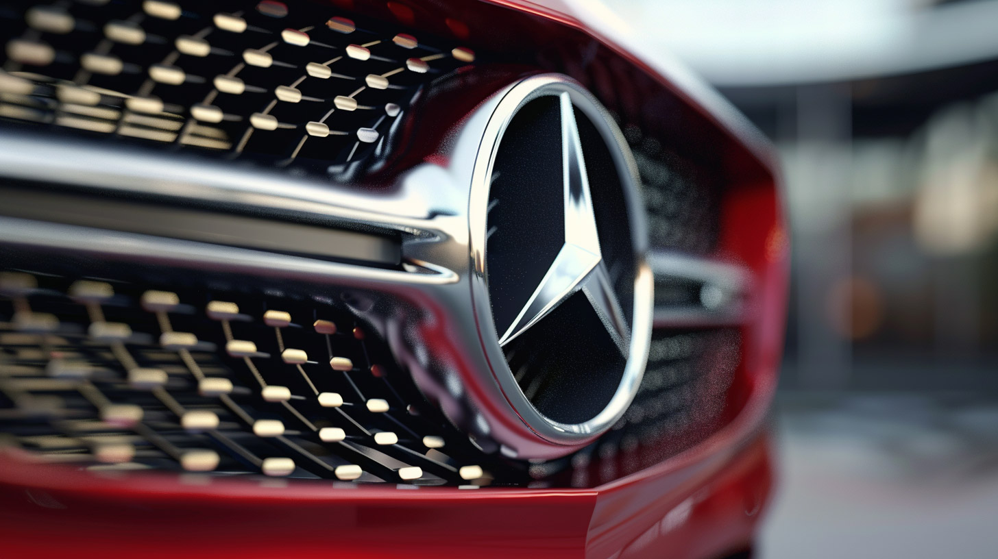
The Mercedes-Benz logo is easily the most recognizable car logo in the world, and is represented by the famous circle-orbited three-pointed star. The three sides of the star were meant to symbolize Daimler’s ambitions of global motorization on land, on water, and in the air.
The three-pointed star of the famous Mercedes-Benz brand is now a formidable display of precise German engineering and luxury craftsmanship, but it has an even more fascinating history. Gottlieb Daimler, the technical director of the gas engine manufacturer, first came up with the concept of using a star. When he started out, he drew a star above his house on a city postcard and mailed it to his wife, declaring that one day this star would shine above their thriving factory and bring wealth.
In 1909, Daimler-Motoren-Gesellschaft registered the three-pointed star as its logo. Benz & Cie also registered their logo, that at the same time has a wreath around the company’s name. The company was renamed Mercedes-Benz after their merger in 1926, resulting in the Benz laurel wreath, which later became a simple ring in 1933. This iconic logo shows the company’s universal motorization with its engines dominating the sea, land, and air.
2- BMW
Bayerische Motoren Werke AG, commonly abbreviated to BMW, is a German multinational manufacturer of luxury cars located in Munich, Bavaria, Germany, and was established in 1916.
The story that the BMW logo represents an airplane propeller has been around for about a century, but as mentioned by Fred Jakobs, Archive Director of BMW Group Classic, that’s not true.
BMW evolved from German aircraft engine manufacturer Rapp, whose logo was a knight (meaning a chess piece) in the center of a circle with the company’s name above the border.
For BMW’s purposes, the name was clearly changed, and the knight was replaced by four quadrants, two of them white and the rest light blue. These are the colors of the Bavarian flag, and more precisely, in the wrong order, to comply with the 1917 trademark regulations.
The badge looks a bit like a propellor, and indeed BMW emphasized this by placing it on the bases of two planes that appeared in an ad in 1929. The company knew the story of the logo’s propellor origin was false, but Jakobs says it “made little effort to correct the myth” for a long time.
3- AUDI
Audi is a German luxury vehicle manufacturer based in Ingolstadt, Bavaria, Germany. A subsidiary of the Volkswagen Group, Audi produces cars in nine production facilities around the world.
Back in 1932, four German car brands – Audi, DKW, Horch, and Wanderer – came together to form the Audi we recognize today.
Although the Audi logo contains four interlocking rings, the company was originally represented by just one of them.
Audi was taken over by the much more successful DKW in 1928. Four years later, the bank of Saxony reached DKW with the suggestion that it should take over two other local manufacturers, Horch and Wanderer, in order to stop a failure of the motor industry in the state during the period of financial crisis in Germany.
All the members of the new Auto Union adopted the four-ring logo, although the Auto Union itself did not become a brand in its own right (except in motor racing) until after the World War II.
DKW was the only original company to survive the war, but when it built its first car with a four-stroke engine in 1965, its then-owner, Volkswagen, decided to drop the name and replace it with the almost-forgotten Audi. Audi has been the only user of this logo ever since.
4- TOYOTA
Toyota is a Japanese car, and is based in Toyota City, Aichi, Japan. The company was founded by Kiichiro Toyoda on August 28, 1937. Toyota is the largest car manufacturer in the world, with the production of nearly 10 million cars every year.
The current Toyota logo first appeared on a model called the Celsior in 1989, although it was not noticed in markets where that car was sold with a different logo as the Lexus LS400.
Although it looks like T letter at first glance, this logo is actually made up of three ovals. According to Toyota, the inner ones represent the heart of the customer and the company, while the large one around them represents the world.
Even more fantastically, the seemingly empty space not occupied by ovals is not formally empty at all. Instead, it represents Toyota’s “infinite values” of quality, value, innovation, safety, the environment, social responsibility and driving pleasure.
The logo was updated in 2006 to look more three-dimensional and metallic, but in 2020 Toyota succumbed to the new fashion for austerity and presented it again in flat black and white.
5- HYUNDAI
Hyundai is a South Korean multinational automotive manufacturer headquartered in Seoul, South Korea, that was founded in 1967.
The Korean word “Hyundai” translates to the English word “modernity”. The name was chosen in 1947, when the brand was getting popularity as a construction company. Over time, Hyundai became Hyundai Motor Company. And finally, Hyundai Motor Company became an international sensation—from Seoul to Austin. The current logo of “New thinking, new possibilities” is also consistent with the forward-thinking philosophy of the Hyundai brand.
The Hyundai logo is instantly recognizable with its smooth curves and modern design.
Hyundai’s logo looks like a slanted “H.” But the details tell a lot about the brand. The letter H leans to the right, indicating a movement into the future.
This logo is very similar to two shaking hands, and this is a sign of Hyundai’s commitment to customer service and teamwork.
It also represents the seller’s transaction with the customer.
The oval shape symbolizes the globe and how Hyundai has extended to car lovers around the world.
6- PORSCHE
Porsche is a well-known German automobile manufacturer with an emphasis in high-performance luxury sports cars, SUVs, and sedans. Founded in 1931 by Ferdinand Porsche.
The Porsche logo has barely changed since it first appeared on the steering wheel of the 356-sports car in late 1952.
It is based on the coat of arms of Württemberg-Hohenzollern, that existed at the beginning of that year, but had been merged with two neighboring states to form what is now Baden-Württemberg by the time the logo was introduced.
The logo has four quadrants, two of which show three black antlers on a yellow background, and the rest show the red and black stripes that form the state flag of Württemberg-Hohenzollern.
Inside is another logo that includes the Ferrari-like horse from both the flag and the coast arms of Stuttgart, where Porsche is based.
7- CHEVROLET
The Chevrolet Motor Car Company was founded on November 3, 1911 in Detroit. It was co-founded by Louis Chevrolet, a Swiss race car driver and automotive engineer, and William C. Durant, the ousted founder of General Motors.
It is an American automobile division of the manufacturer General Motors (GM).
Like Buick, Chevrolet is known as the Bow Tie brand because of its logo, but no one appears to have suggested that it was actually inspired by a bow tie. Margery Durant, daughter of company co-founder William Durant, wrote in 1929 that her father had designed it himself while having dinner at home.
Thereafter, 32 years later, a publication celebrating Chevrolet’s 50th anniversary made a wholly different claim that Durant had seen the design on the wallpaper of a French hotel in 1908: “He tore off a piece of wallpaper. And kept it to show friends, with the thought that it could be a good nameplate for a car.”
Both stories were contradicted in 1973 by Durant’s second wife (and Margery’s stepmother). She mentioned that William saw it in an advertisement in a newspaper he was reading at a hotel in Hot Springs, Virginia, in 1912, and said, “I think that would be a great logo for the Chevrolet.”
She did not identify the advertisement, but further research revealed it was for Coalettes, a product made by the Southern Compressed Coal Company. The similarity between the Coalettes and the Chevrolet logos is really striking.
8- FERRARI
Ferrari S.p.A. is an Italian luxury sports car manufacturer based in Maranello, Italy. Founded in 1939 by Enzo Ferrari, the company made its first car in 1940, adopted its present name in 1945, and started producing its current line of road cars in 1947.
The Cavallino rampant, or running horse, has been part of the Ferrari logo since Ferrari was a race team rather than a car manufacturer.
It is in a rectangle (or sometimes a logo) under the colors of the Italian flag, and on a yellow background that may symbolize Enzo Ferrari’s hometown of Modena, whose own flag is partly that color and partly blue.
The horse is similar to the logo used by the fighter pilot Count Francesco Baracca, and was offered to Ferrari when Baracca’s parents presented him with a trophy after winning a race in an Alfa Romeo in 1923.
The Baracca family’s coat of arms has a similar horse, that is perhaps where the Ferrari came from, but another can be seen on the Stuttgart flag. According to one story, the plausibility of which you can judge for yourself, Baracca took it because the first plane he shot down in World War I was piloted by an unfortunate fellow from Stuttgarter.
9- LAMBORGHINI
Founded in 1963, and is headquartered in Sant’Agata Bolognese, in Northern Italy.
Lamborghini currently produces two super sports car models, the V12-powered Aventador, launched in 2011, and the V10-powered Huracan, launched in 2014, along with the Urus Super SUV powered by a twin-turbo V8 engine, introduced in 2017.
This logo is designed in the form of a shield with a black backdrop and golden lines. The word “Lamborghini” is written on the top of the shield, above the image of a bull.
The use of the bull in the Lamborghini logo have two purposes. First, it represents the founder of the business, who was born on April 28, 1916, in Romagne, Italy. This shows that he was born under the zodiac sign of Taurus, which is symbolized by a bull. Moreover, the founder of the company was fond of bullfighting and regularly participated in bullfighting events.
Second, the bull has powerful connotations, like power, speed, dominance, and danger.
The color scheme of the logo is symbolic as well. The Lamborghini logo consists of just two colors: black and different shades of gold. Black is a striking and distinctive color which is often associated with power and authority. It also evokes images of elegance and simplicity.
When Ferruccio Lamborghini first unveiled its Lamborghini logo, he was criticized for it. This was because the logos of Lamborghini and its rival Ferrari were strikingly similar. Lamborghini always mentioned its competition with the other car brands, so this was not an accident. The shield shape of the logo, the use of gold and black, and the fact that both logos contain an animal, although the Ferrari logo is a horse instead of a bull, are all similarities.
10- Jaguar
Jaguar is an Italian luxury sports car manufacturer based in Maranello, Italy. Founded in 1939 by Enzo Ferrari (1898-1988), the company built its first car in 1940, and started producing its current line of road cars in 1947. Ferrari became a public company in 1960.
Strangely, this British brand (though now owned) is represented by a species of cat native to North, Central and South America.
The image of a jaguar beginning to jump on its prey first appeared in 1945 and has hardly changed since then.
The stance is the same, but some tweaks have been made, such as a 3D effect that was added in 2012 and, contrary to the present trend, is still there.
The front logo of each model provides a different image of the Jaguar. It faces forwards with its mouth open and fierce, as if the onlooker is the prey. Luckily, there is no similar rearward view at the other end.


 (3 votes, average: 3.33 out of 5)


